
Marketing
E-Commerce Design Mistakes That Cost You Sales
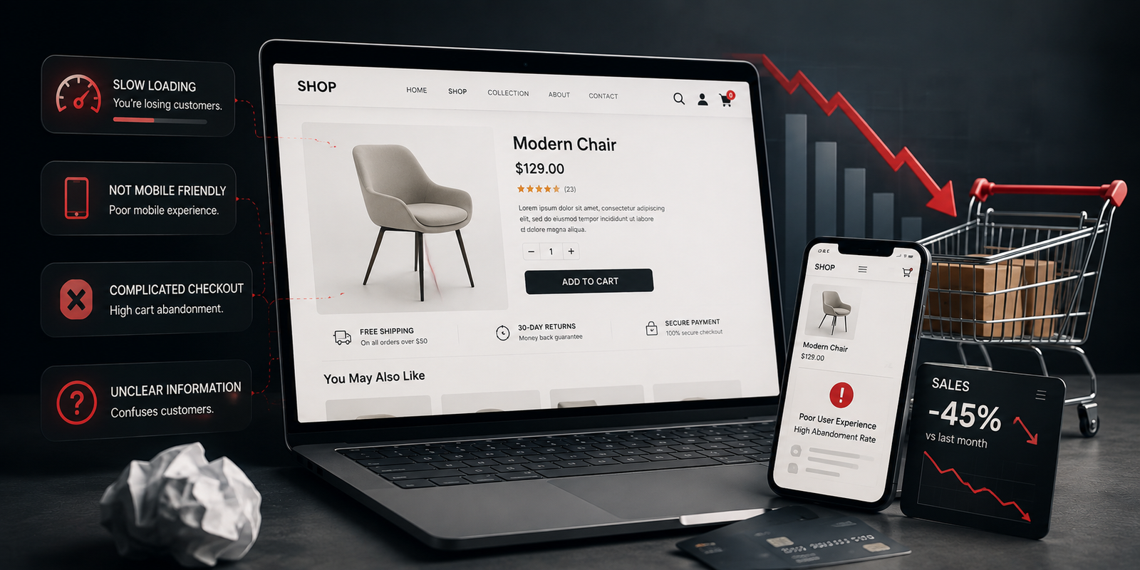
Most online stores do not lose sales because of the design of the product page. They lose them in a handful of predictable places, and the fixes are rarely expensive.
Hiding what things cost
Unexpected shipping cost at the final step is the most reliable way to lose a sale ever devised. State delivery charges and timescales on the product page. A higher number shown early converts better than a lower one revealed late.
Too few photographs
People cannot pick the item up. Show it from several angles, at scale next to something familiar, and in use. One catalogue shot on white is not enough to overcome the doubt that stops someone buying.
Forcing account creation
Guest checkout should always be available. Someone buying for the first time has no reason to want an account with you, and asking for one before they have any relationship is the clearest possible signal that your convenience matters more than theirs.
Vague delivery and returns
“Fast dispatch” means nothing. “Ordered before 2pm, posted the same day, arrives in two to three working days” means something. The same is true of returns: a clear, generous policy stated plainly removes the last hesitation before checkout.
Neglecting the phone
The majority of browsing happens on a phone. Test the whole path — search, filter, add to basket, checkout — with one thumb on a real handset. Filters that are unusable on a small screen are quietly costing you a great deal.
No reassurance at the point of payment
The checkout is where doubt peaks. Contact details, a returns link, the delivery date and a visible security indicator all belong on that page. It is the least decorative screen on the site and the one worth the most attention.