
Web Design
10 Web Design Trends Shaping 2026
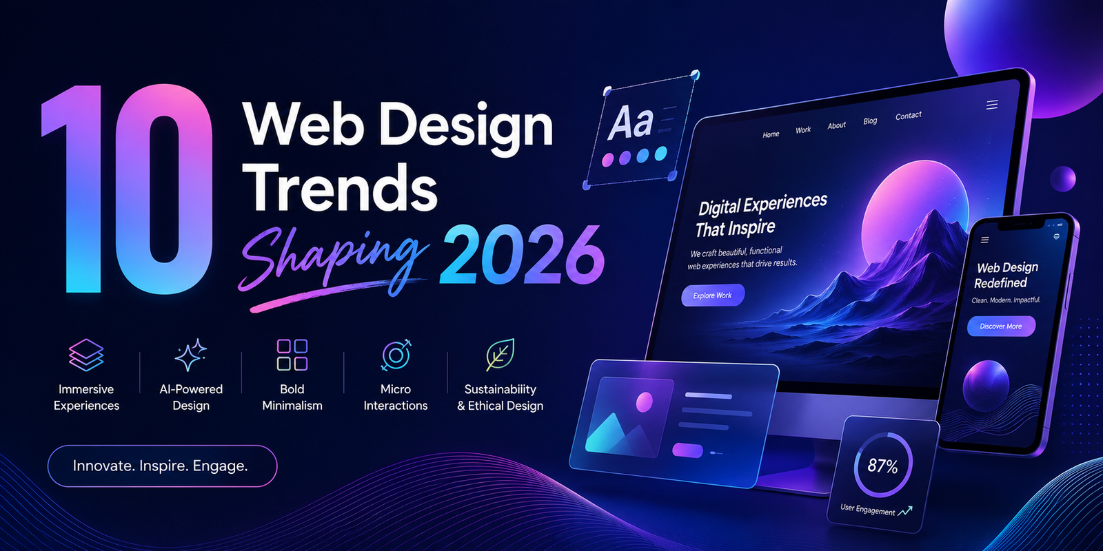
Every year brings a fresh crop of design trends, and most of them are noise. The ones worth your attention are the shifts that change how a website performs — how quickly it earns trust, how easily people use it, and whether it still holds up two years from now.
Here are the ten shaping premium websites in 2026, and what each one actually means if you are planning a build or a redesign.
1. Layouts are loosening up
After a decade of strict twelve-column grids, layouts are softening. Organic shapes, flowing lines and deliberately off-grid compositions are replacing the rigid uniformity that made so many sites feel interchangeable.
This is not an excuse for chaos. The best examples still sit on a disciplined underlying structure — they simply stop announcing it. If every section of your site starts with the same three-column block, that sameness is what visitors remember, and not in a good way.
2. Typography is doing the heavy lifting
Type has moved from a legibility problem to the primary storytelling device. Oversized headlines, custom typefaces and layered treatments are carrying brand personality in places a photograph used to.
It is also the cheapest premium signal available. A considered typeface pairing, generous line height and real attention to line length will make a modest site feel expensive far more reliably than another stock photograph will.
3. Tactile brutalism as the counterweight
Running directly against the soft, organic trend is a harder aesthetic: sharp geometry, stark contrast, hairline borders and unapologetic structure. Both are reactions to the same problem — the flat, rounded, faintly generic look that dominated the early 2020s.
Pick one. Sites that try to be soft and organic in the hero and severe and geometric further down read as indecisive rather than layered.
4. Colour is splitting in two directions
Two palettes are gaining ground at once. Saturated, high-energy colour is back, carried along by Y2K nostalgia and so-called dopamine design. At the same time there is a move toward what has been called nature distilled — muted, earthy tones drawn from wood, soil and skin.
The second ages considerably better. Loud palettes date quickly, and a rebrand-by-repaint every eighteen months is an expensive habit.
5. Real depth, not decorative shadows
Depth is returning through genuine three-dimensional work — WebGL scenes, interactive product models, and in retail, augmented-reality previews — rather than the drop shadows of skeuomorphism’s first run.
Treat this one with caution. A 3D scene that adds two seconds to your load time will cost you more visitors than it impresses. Used on a single hero moment, it can be remarkable; used everywhere, it is a performance problem wearing a nice coat.
6. Motion tied to intent
Scroll-triggered animation has matured. The interesting work now responds to what someone is actually doing — revealing detail as they show interest, holding still when they are reading.
The test is simple: if an animation delays someone from reading the sentence they came for, it is decoration. If it helps them understand where they are, it is design.
7. Personalisation moves into the interface
AI has stepped out from behind the scenes. Homepage messaging that adapts to different visitor types, calls-to-action that shift based on behaviour, content ordered by what someone looked at last time — this is now ordinary rather than experimental.
It only works if you have something worth adapting. Personalisation applied to thin content simply rearranges the thinness.
8. Accessibility stopped being optional
This is the most consequential item on the list, and the one most often missed.
The European Accessibility Act came into enforcement in June 2026. It applies to websites and digital services sold to consumers in any EU member state regardless of where the business is headquartered — so a Canadian company selling to customers in Europe is inside its scope. The required standard is WCAG 2.1 Level AA, by way of the European standard EN 301 549, with an updated version incorporating WCAG 2.2 expected during 2026.
In practice that means real contrast ratios, full keyboard operability, descriptive headings and links, and forms that explain their errors properly. Penalties include fines — several member states apply daily fines for ongoing non-compliance — and, in some cases, orders to suspend a service.
The upside is that accessible sites are simply better sites. Clear structure, sensible contrast and properly labelled controls improve usability and search visibility for everyone, not only for people using assistive technology.
9. Performance is a design decision
Speed is not something to optimise after the design is signed off. It is decided the moment you choose a full-screen video hero, four typeface weights, or a carousel loading eight images nobody scrolls to.
The most useful question during a design review is not “does this look good” but “what does this cost to load, and is it worth it?”
10. The reaction against sameness
After a couple of years in which a great deal of the web was generated from the same handful of tools and prompts, the pendulum is swinging back toward work that is unmistakably made by people for a particular business.
Photography of your actual premises. Copy in your own voice. Detail that could not have been produced for anyone else. That is increasingly what separates a site that converts from one that merely exists.
What to take from this
If you act on only two items, make them accessibility and performance. They carry legal and commercial consequences, they compound over time, and they are considerably cheaper to build in than to retrofit.
The aesthetic trends are worth knowing, but they are choices. Pick the ones that suit your brand and ignore the rest — a site built to chase every trend of 2026 will look exactly like 2026 by the time 2028 arrives.